CLIENT
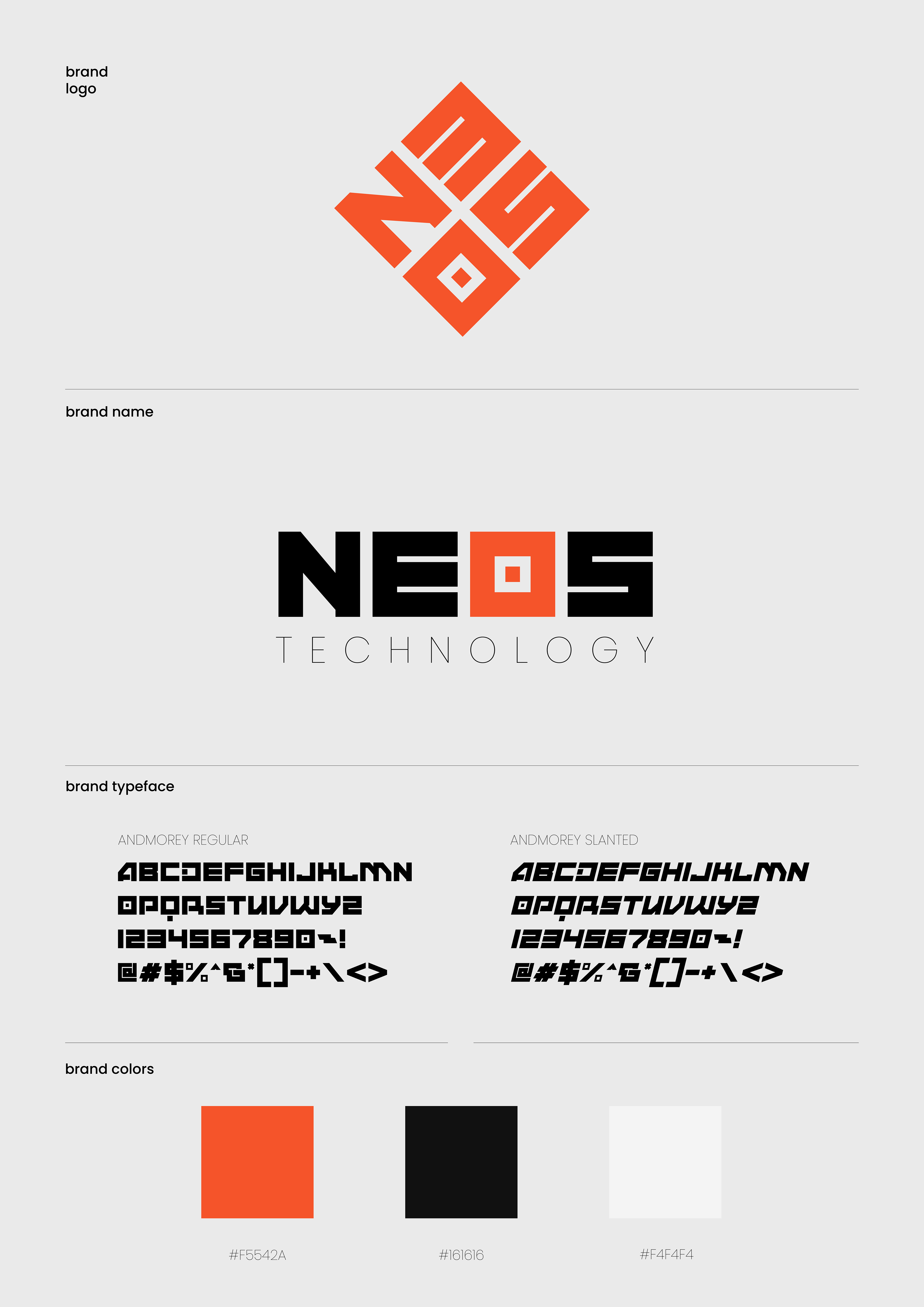
NEOS TECHONOLOGY
Year PROJECT DURATION DISCIPLINES INVOLVED
2024 February 1st - April 12th Experiential Design
Product Design
Graphic Design
PROJECT
OBJECTIVES
NEOS TECHNOLOGY is a small technology company that aims to improve everyone's quality of life through creative features integrated into their electronics. therefore, Neos's first step is to create a smartphone, the most popular gadget in our life, and showcase it at their booth at MWC (Mobile World Congress) 2024.
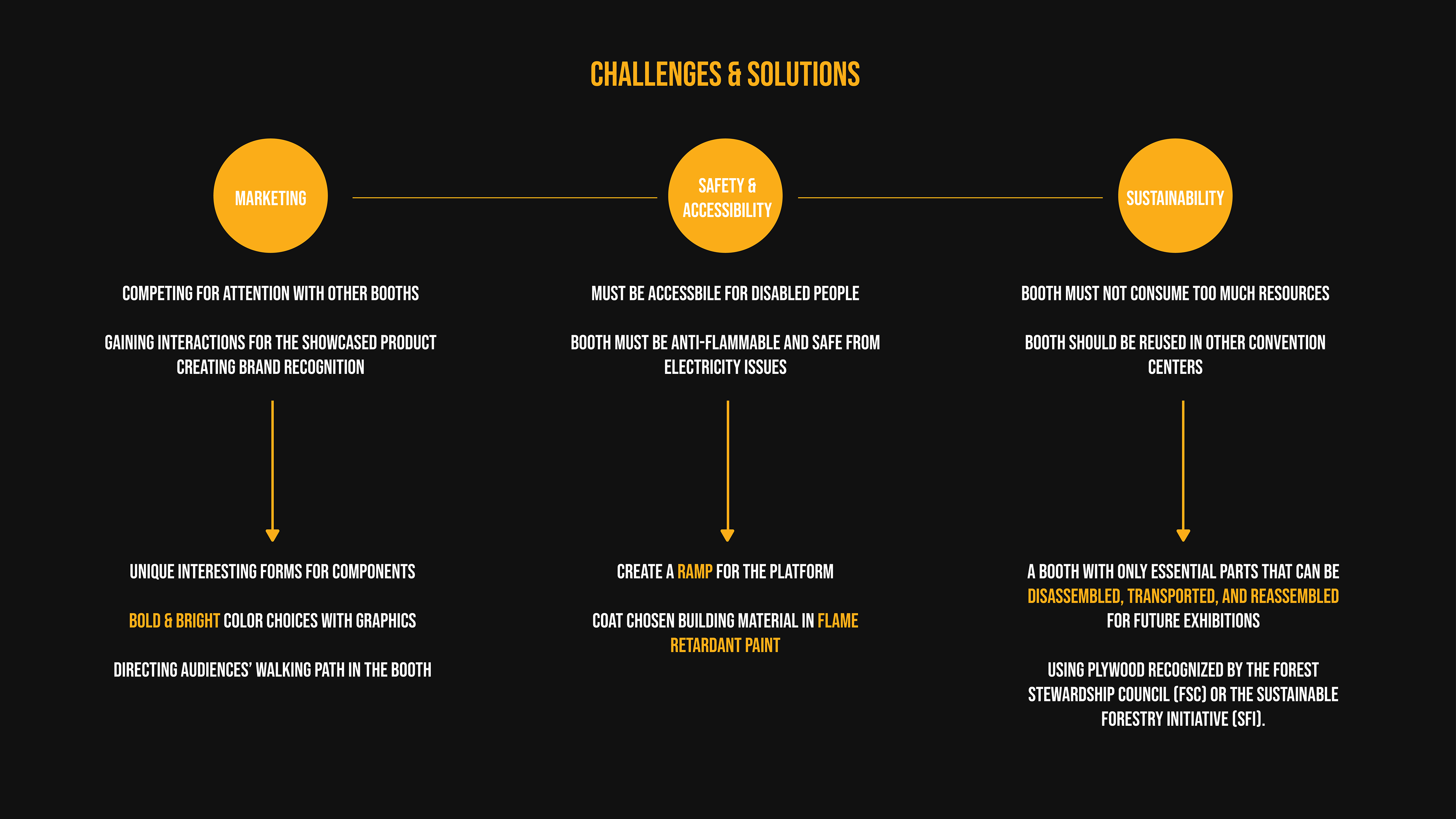
The goal of this project is to create an exhibition booth for NEOS at the MWC. The booth must be environment-friendly and aligns with the company's aesthetic.
LOGO MOODBOARD
The first thing I wanted to create was the branding logo since this is a fictional company. As for the aesthetics, I planned to follow a modern, futuristic style, with a little mix of Cyberpunk and Interstellar (sci-fi video game and movie, respectively).

NEOS - THE ORIGIN
NEOS, in Greek, means new, young, and youthful, which fits very well with a company that aims to innovate daily life through new technologies.
Above is my thumbnailing process. For this particular logo, I explored shapes by playing around with different fonts rather than drawing freehand symbols to achieve fast and effective results.
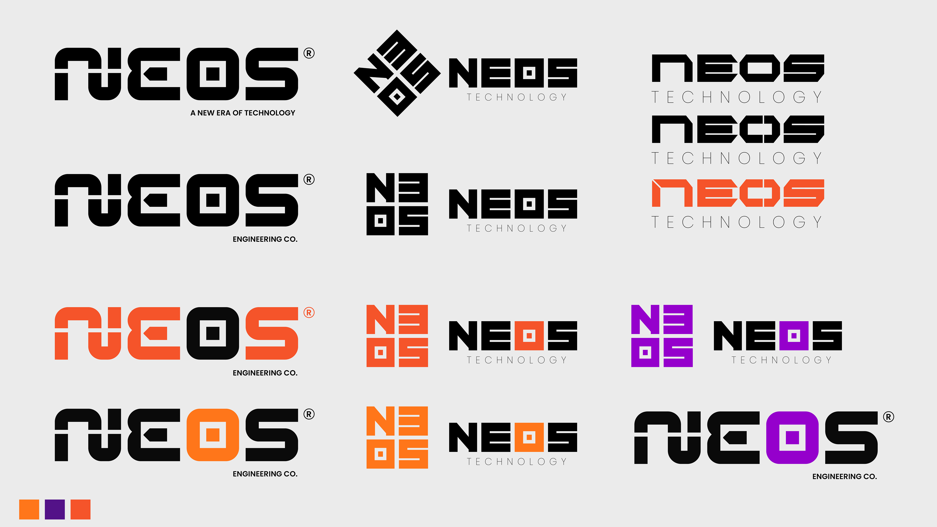
BRANDING COLOR
After discussing with my mentor, I only had three logos to decide. During this process, I also wanted to choose the primary color for NEOS. all three colors communicate the feeling of innovation. However, purple brings about feminine energy, bright orange conveys elegance, and red-orange gives a youthful, energetic vibe.
A glimpse into customers' perspectives
To obtain regular customers' perspectives regarding logo design, I discussed it with some of my non-designer friends. They all ended up selecting the middle concept, as they believe the square shape gives a solid and trustworthy feeling for a technology brand.
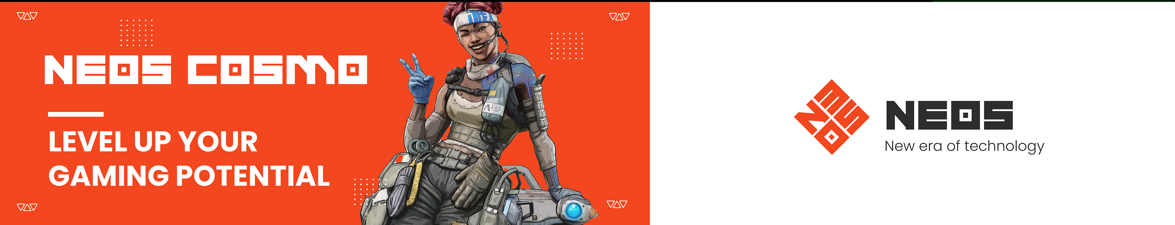
As for the brand color, I went with orange-red. Since my target market involves young people who love new technology, as well as sci-fi and modern aesthetics, I believe this color will best impress them.
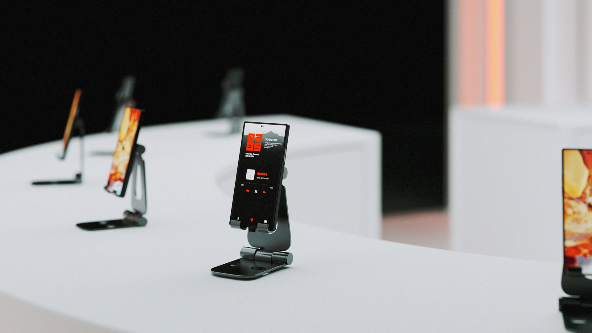
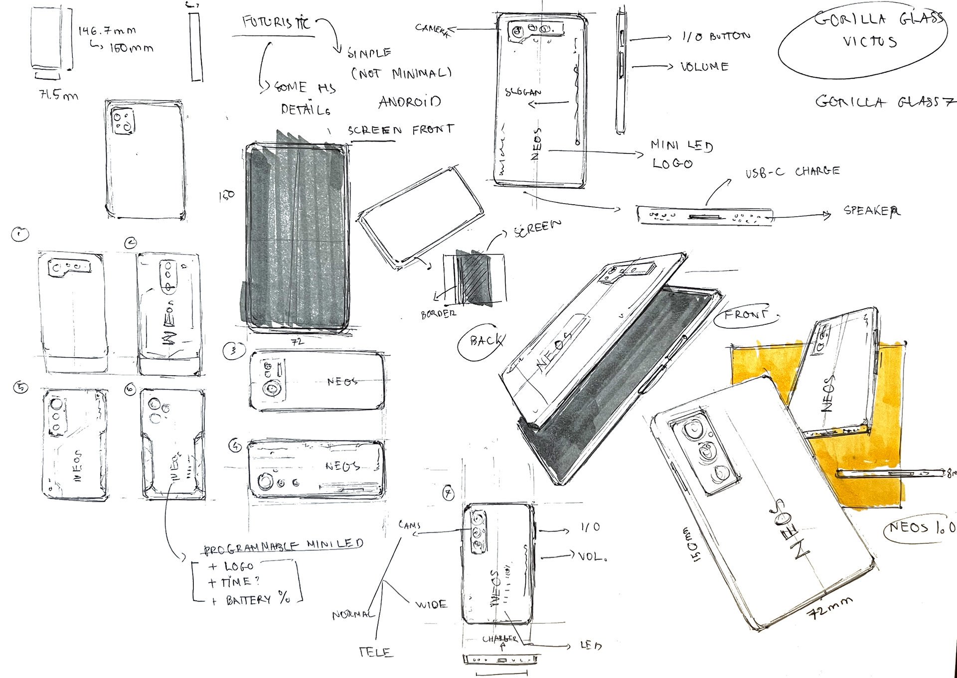
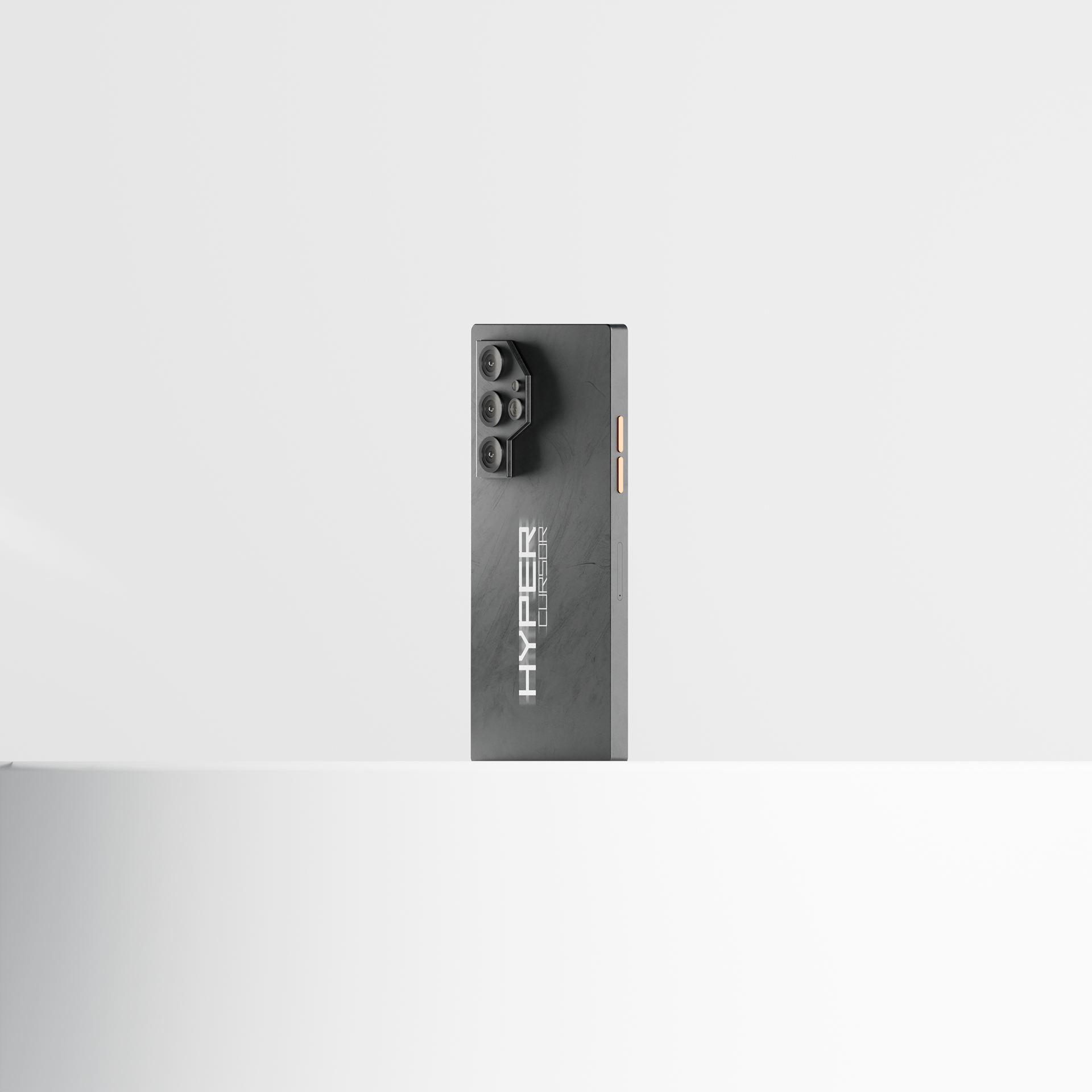
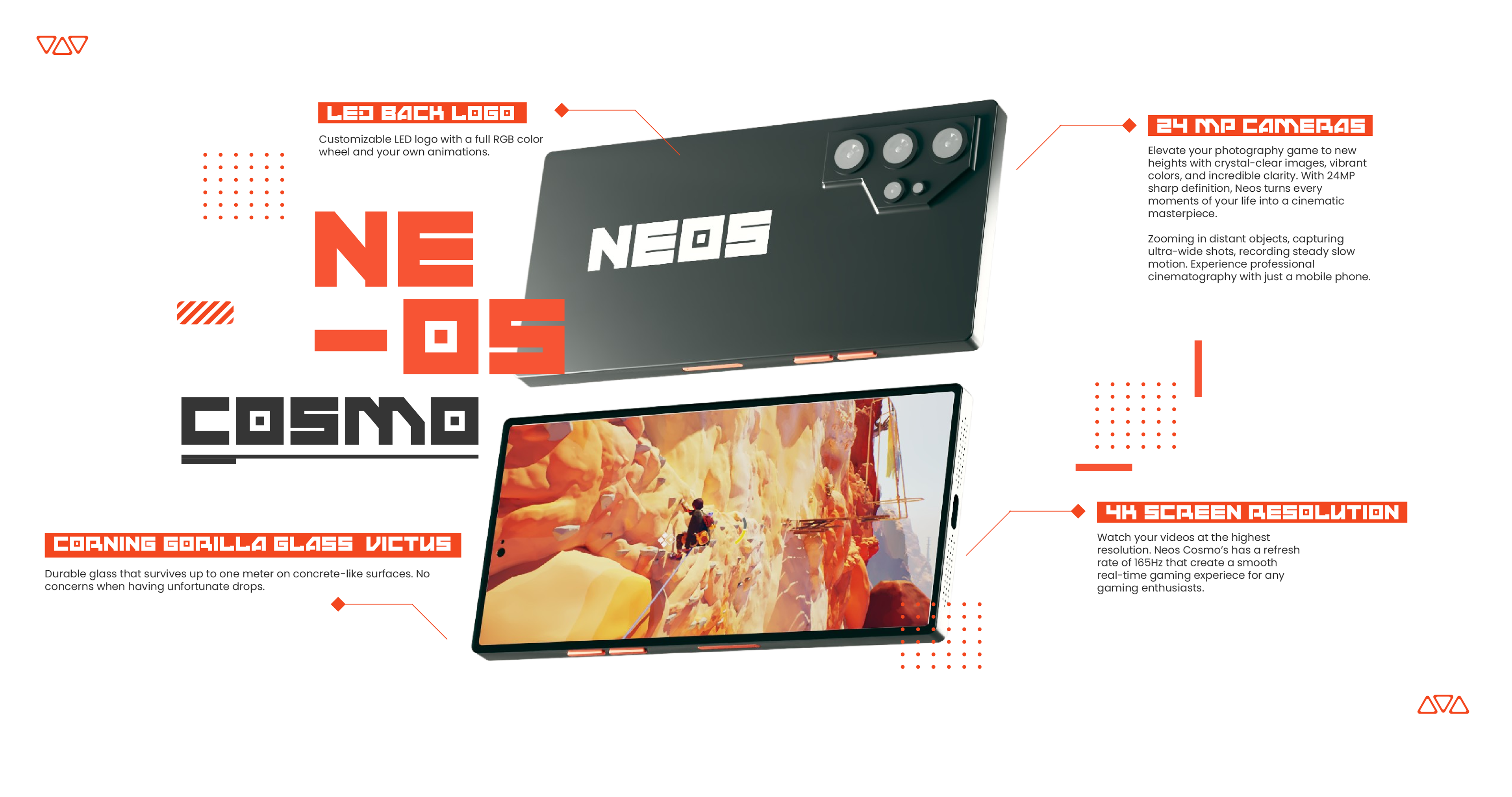
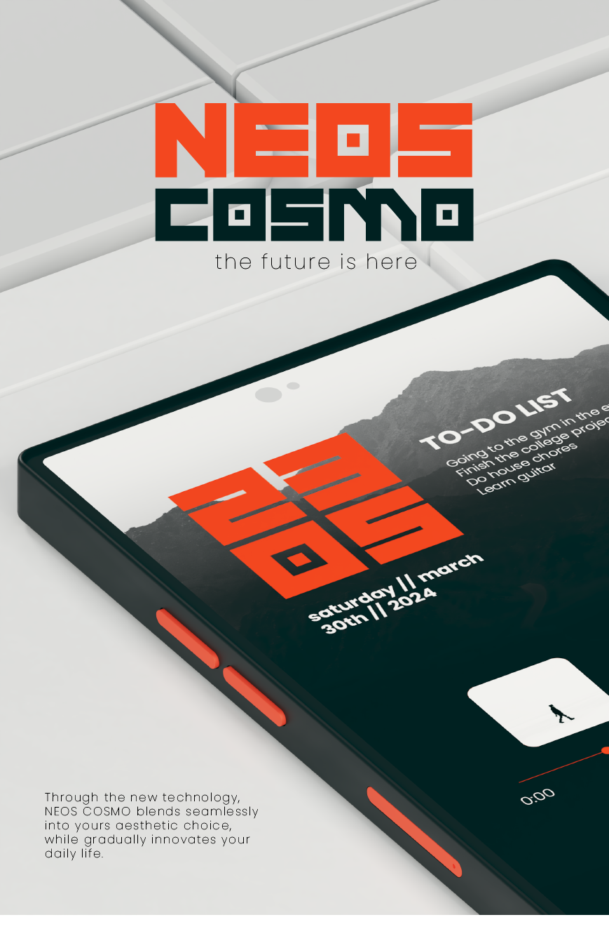
MODELING THE PHONE
The next thing to work on is the product that will be used in the final renders and graphic elements: the smartphone. Since this is an experiential design project, I keep the phone simple.
On the left is my sketch done with markers on A4 paper. On the right is a render test done in Blender. Note that its logo is just a placeholder, as I designed this phone before working on the official logo.
WORKING ON THE BOOTH
The booth was used for the MWC (Mobile World Congress) 2024, held in Barcelona in February. it would follow the same aesthetics as the logo to convey a stronger branding message.


CHOOSING THE LOCATION
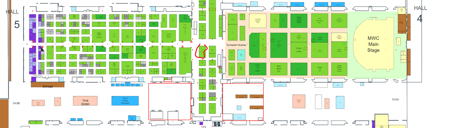
The event took place at the International Barcelona Convention Center. The booth will be held at spot CS50, where Bayern International GmbH is. This place lies at the intersection between Hall 4 and 5, so it will be able to capture the audience from multiple directions.
The dimensions of this space are 8x14 meters, which is more than ideal for a medium-sized booth.
INSPIRATIONS
Since NEOS is a technology brand, the booth will follow a modern and somewhat futuristic aesthetics similar to its logo.
The challenge here is keeping the booth looking contemporary because going overboard with sci-fi will result in a childish and toy-like look, making the booth become a gaming stand rather than a technology-showcasing space.

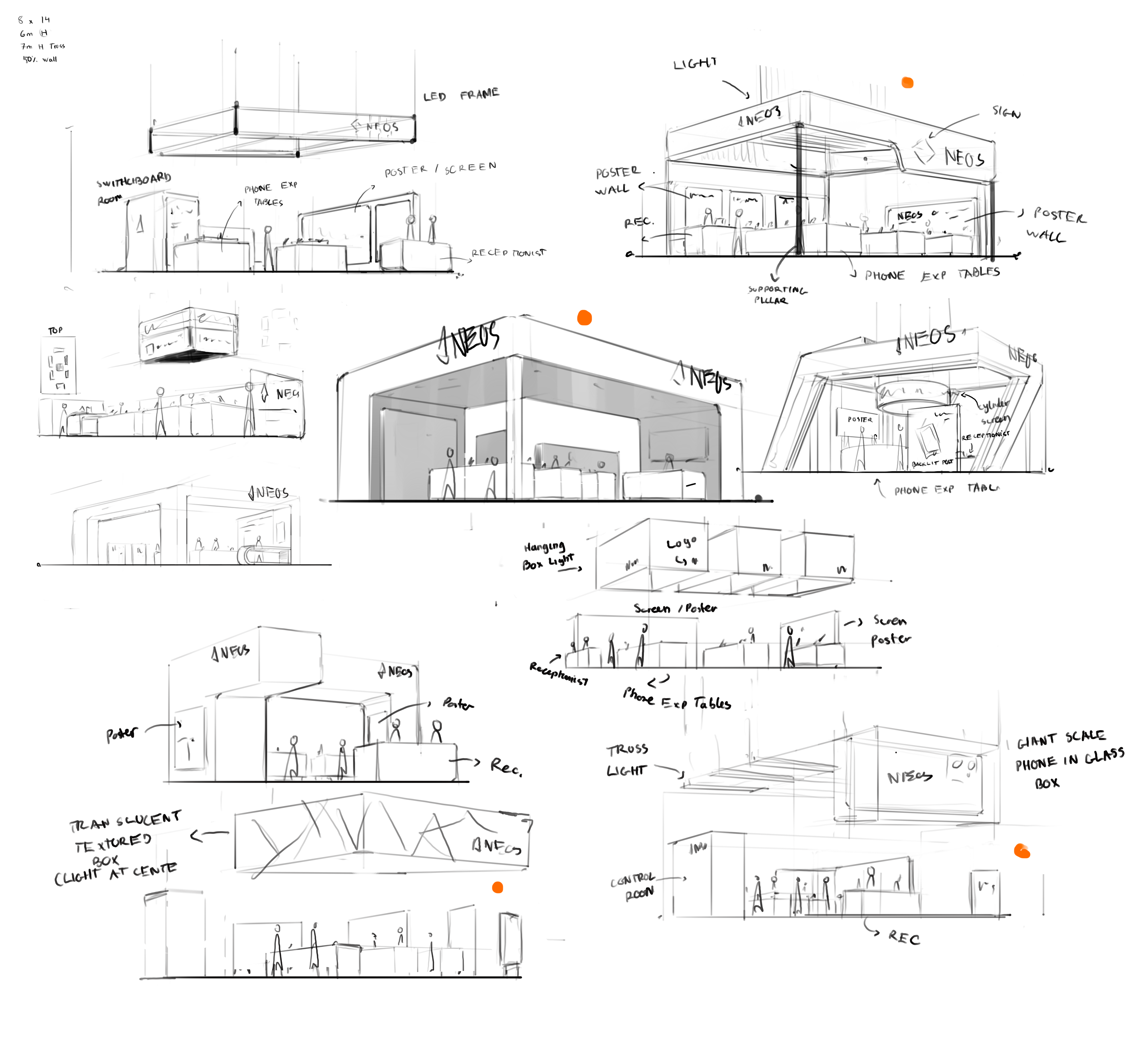
THE FIRST THUMBNAILS
The initial sketches were meant for exploration. During this phase, I focused mostly on putting down larger shapes and creating overall compositions.
The orange dots represent the ones that I liked the most.
GETTING DEEPER
The next step is to refine the chosen concepts with finer details. During this process, I explore different types of styles, shapes, and forms, as well as layouts and features.
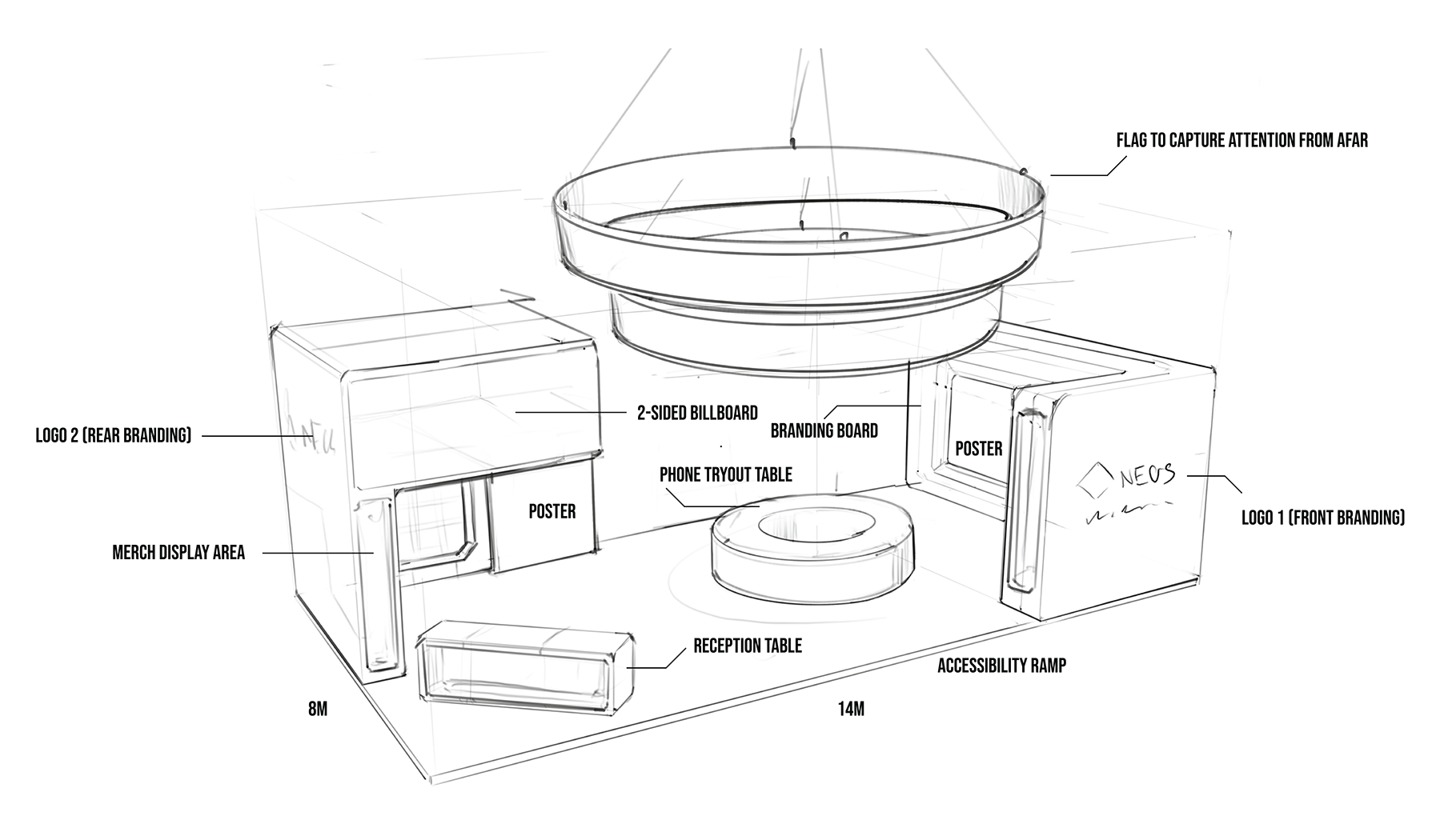
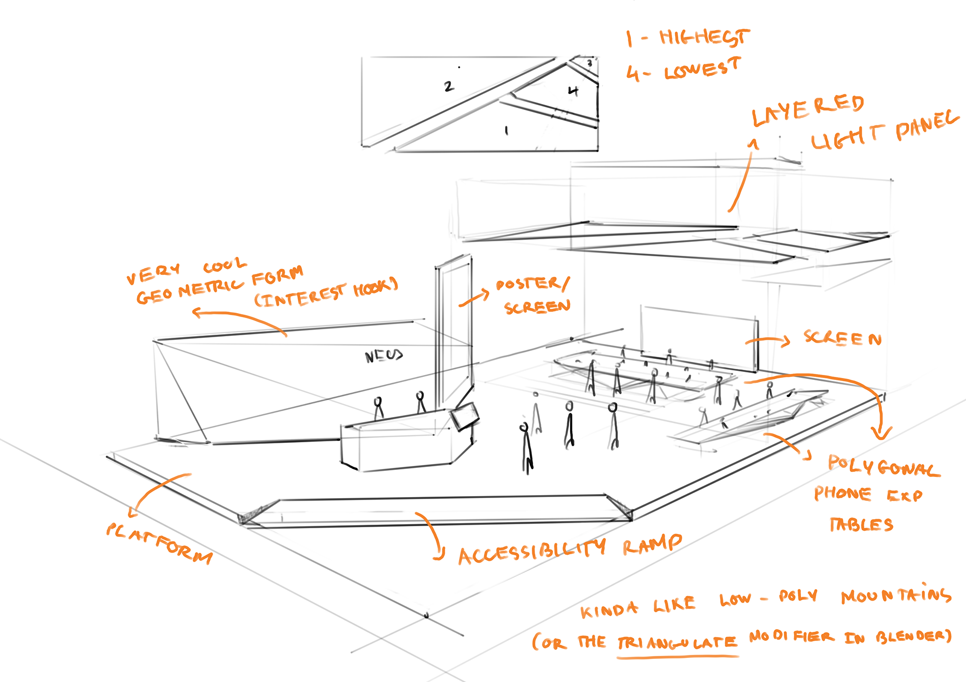
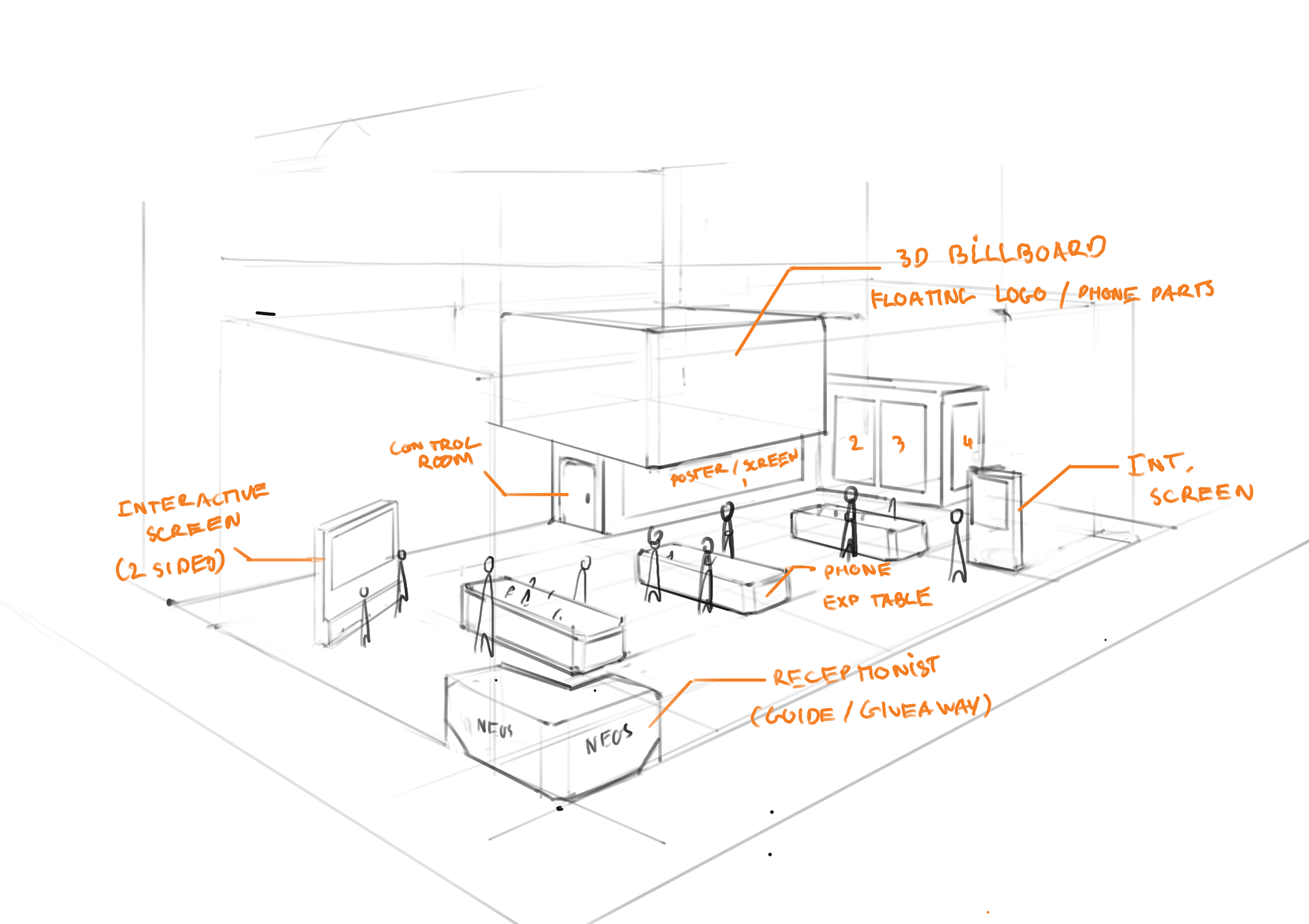
FINAL SKETCH - THe ESSENTIAL ELEMENTS
Since the booth has to be sustainable, Waste and resources have to be minimized. Therefore, only the necessary parts will be put in. They also need to be separated for transportation, assembly, and disassembly purposes.
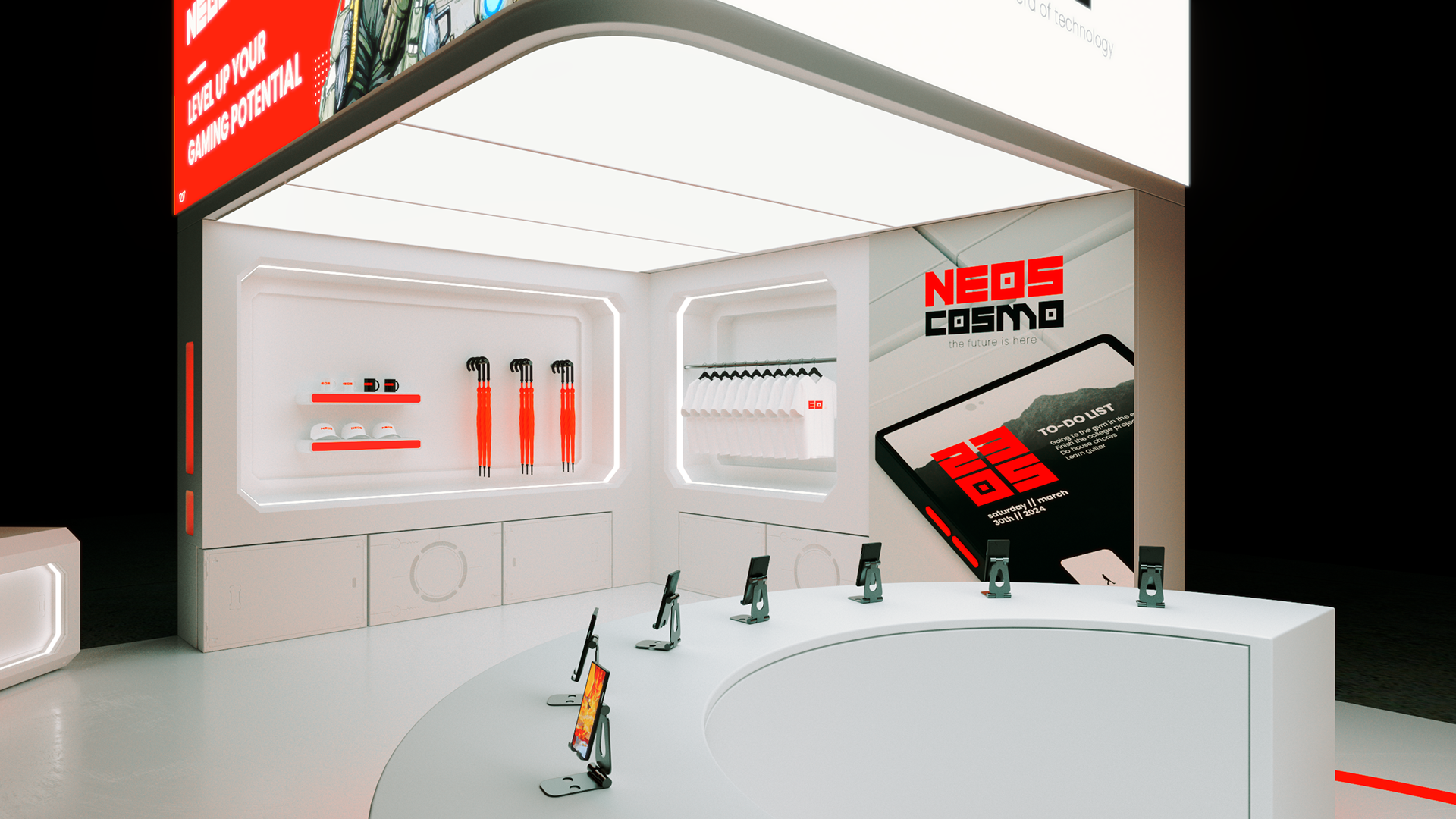
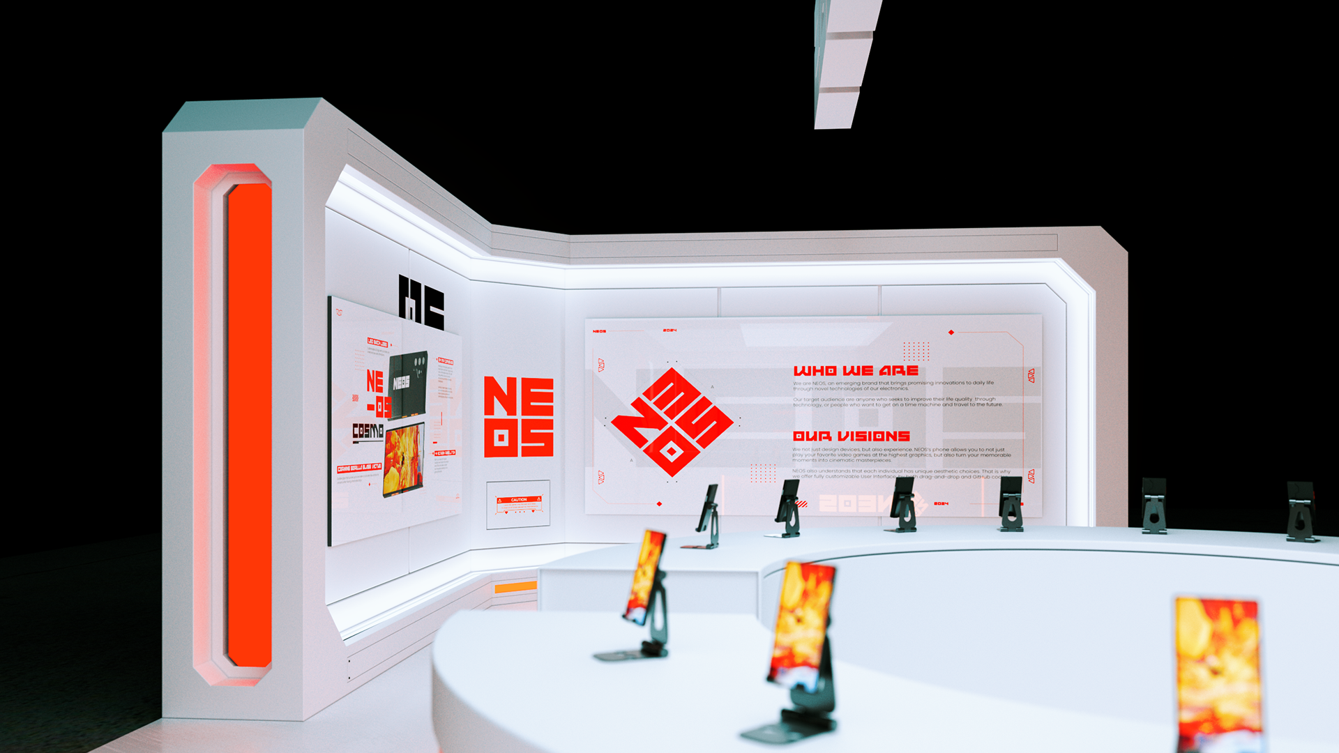
A strong exhibition booth needs to have: a reception table, a product experiencing area, a merch giveaway area, and any mediums used to create brand impressions.


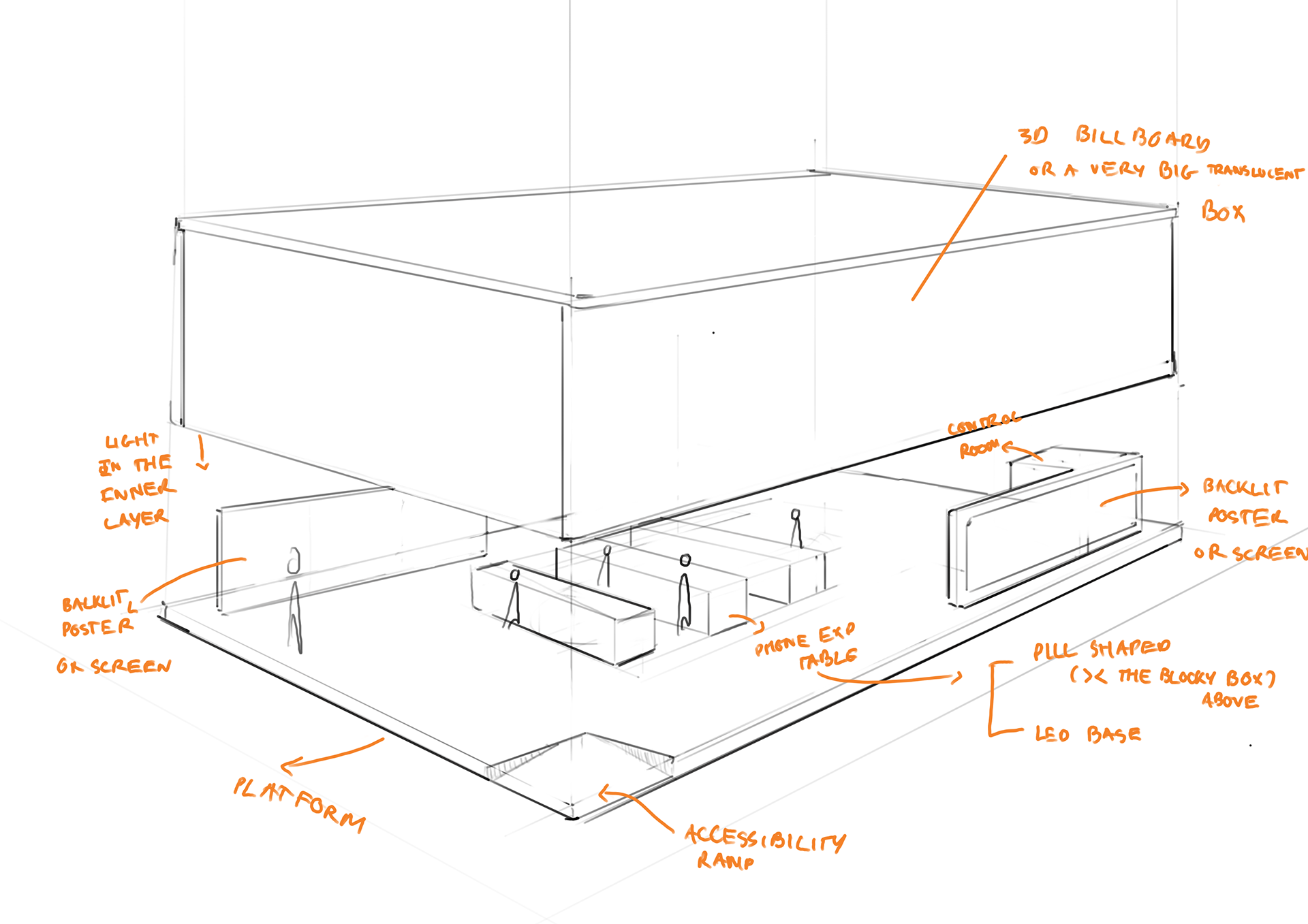
FIRST 2D to 3d ITERATIONS block-outs
Combining all concepts, along with my mentor's feedback, I create two variants of the booth. similar to the sketching phase, I focused on putting down general shapes.
However, after reviewing, I felt like something was still missing. There had to be some elements that spoke "NEOS." There has to be some sci-fi and futuristic attributes. After discussing with my mentor, I began to push the concepts further with the statement below in mind.
It's not about just designing a space, it's also about designing
AN IMMERSIVE EXPERIENCE
And so, the notion of putting in the core essence of video games and movies came to my mind, resulting in the emergence of the two aesthetic styles.

A HyBRID aesthetic
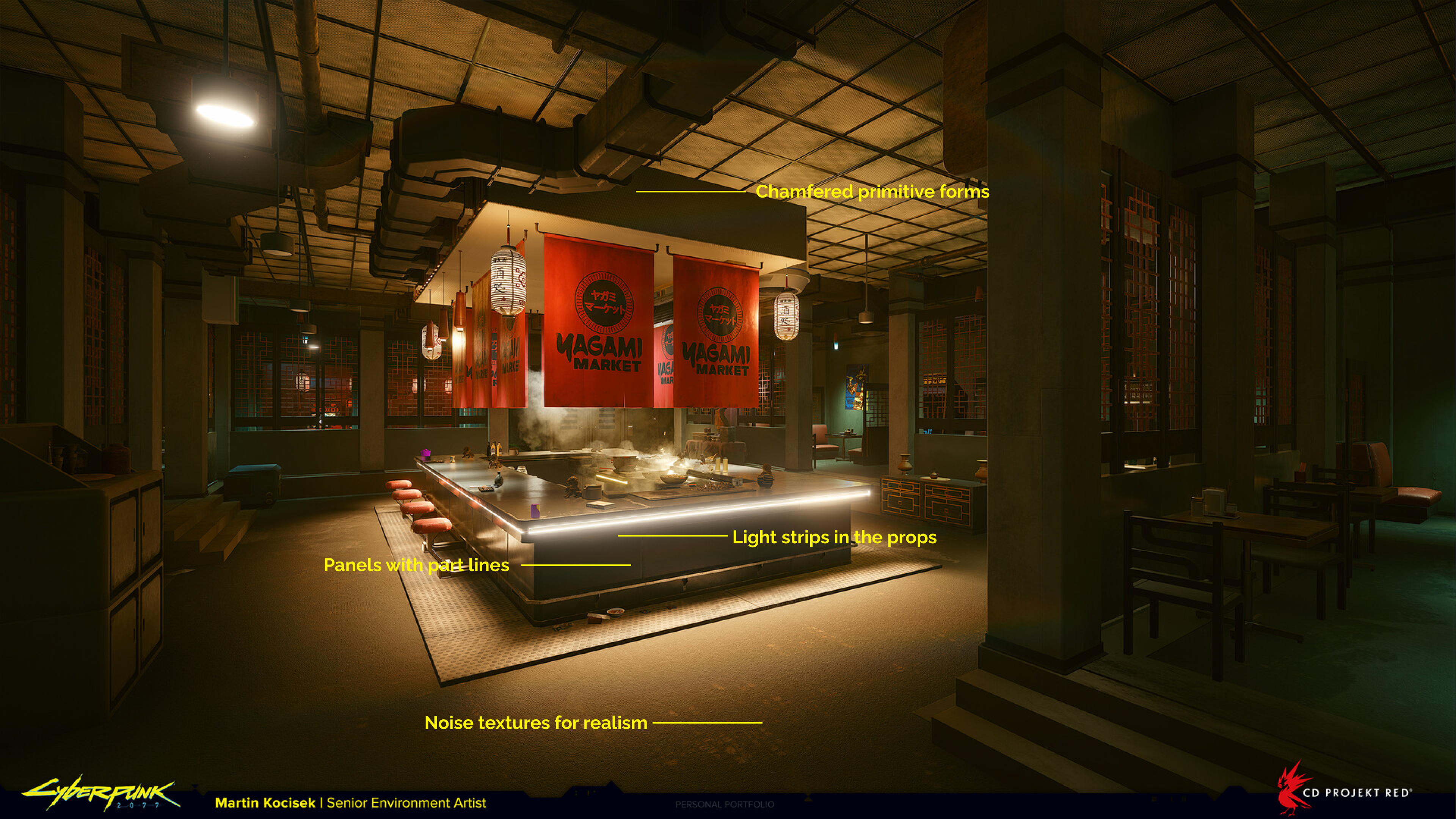
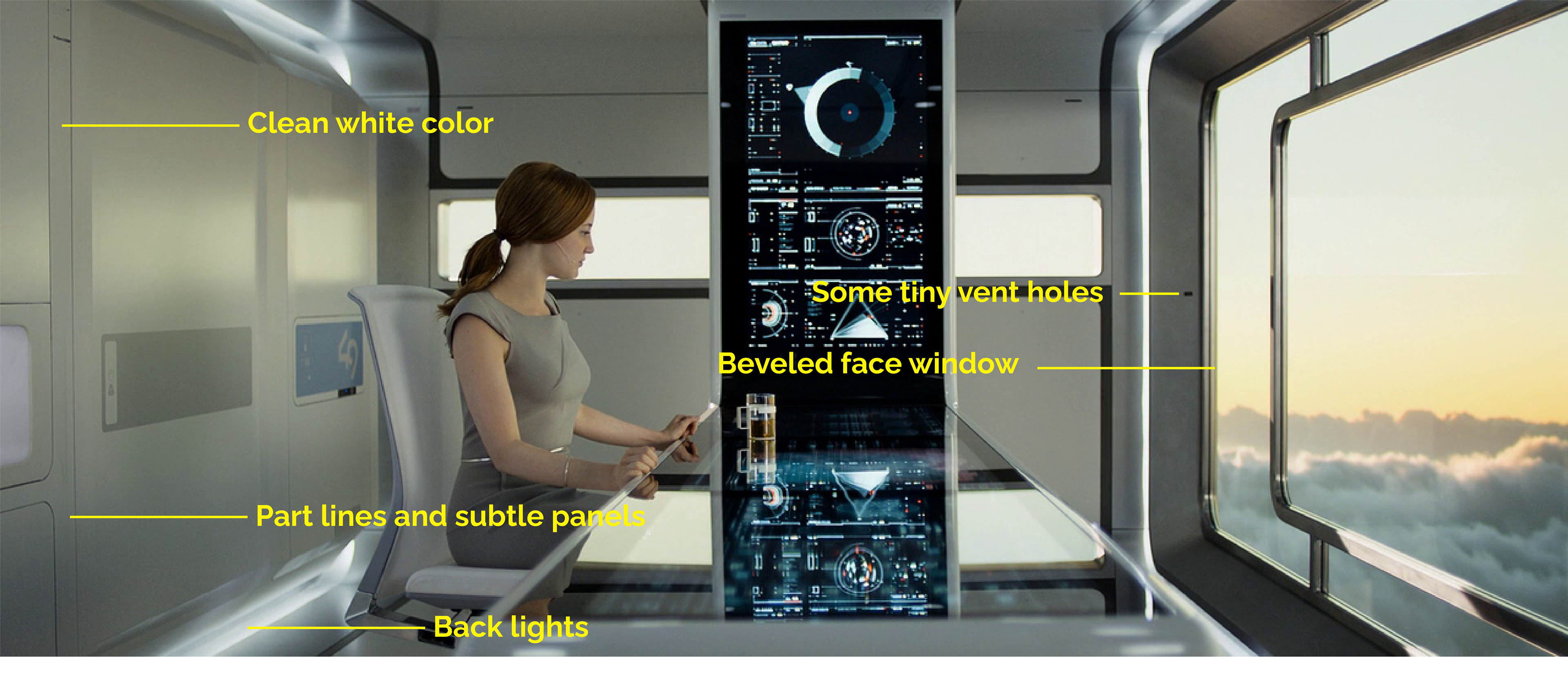
I played "Cyberpunk 2077" and delved into its concept art, finding keyframes in "Oblivion" to analyze them. Even though both are about high-tech society, the former is a degenerated universe, while the latter is more about sleek and elegant designs. That is, I intended to combine the angular forms and the atmospheric effect of Cyberpunk with the use of colors and small details of "Oblivion."
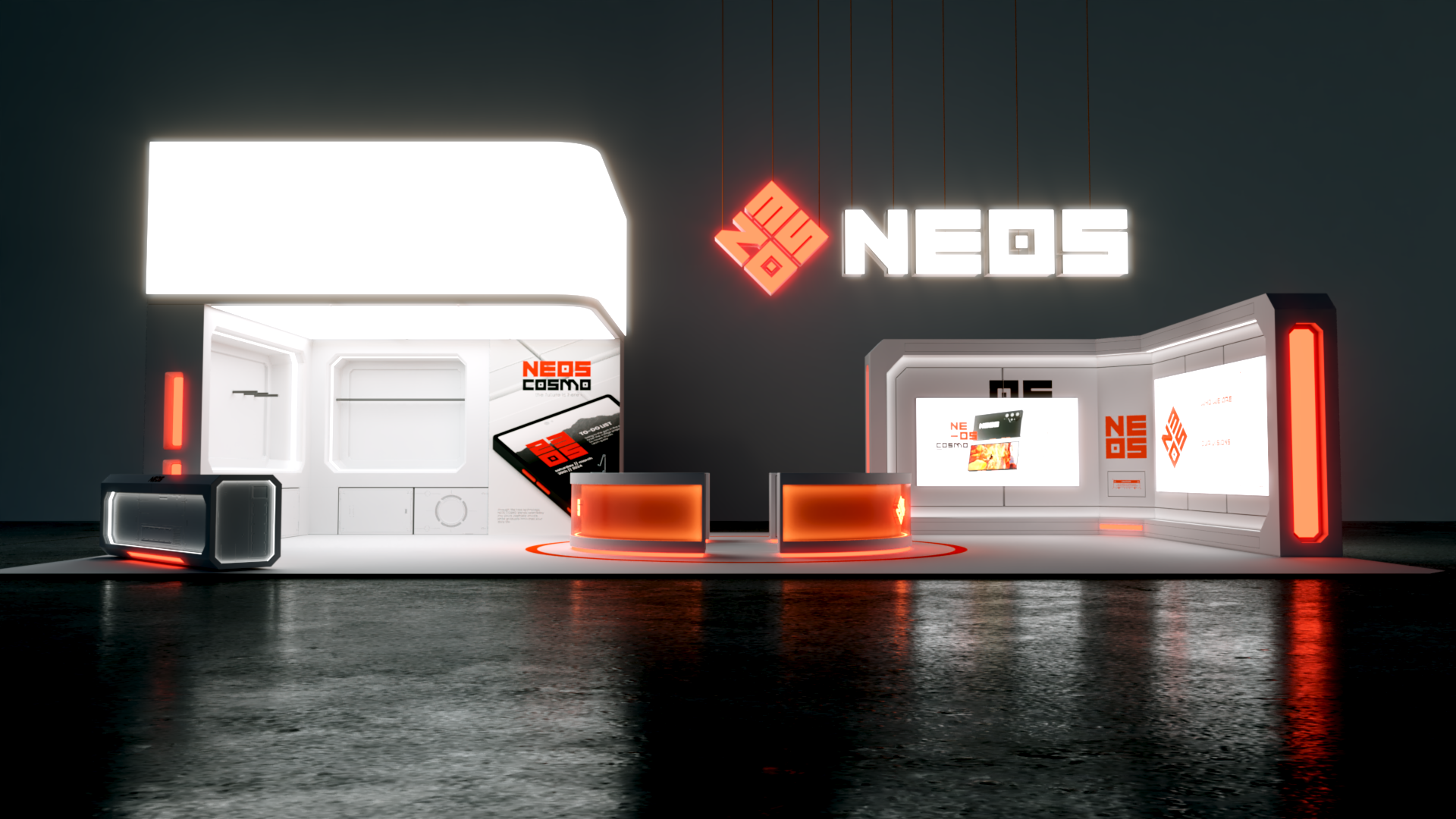


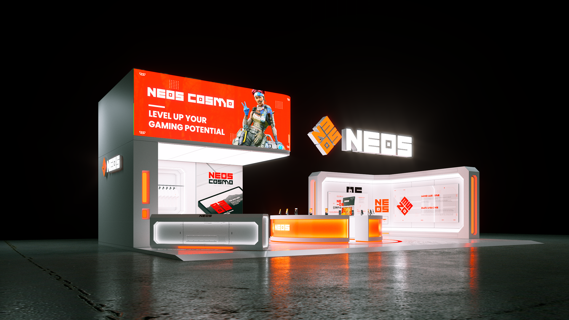
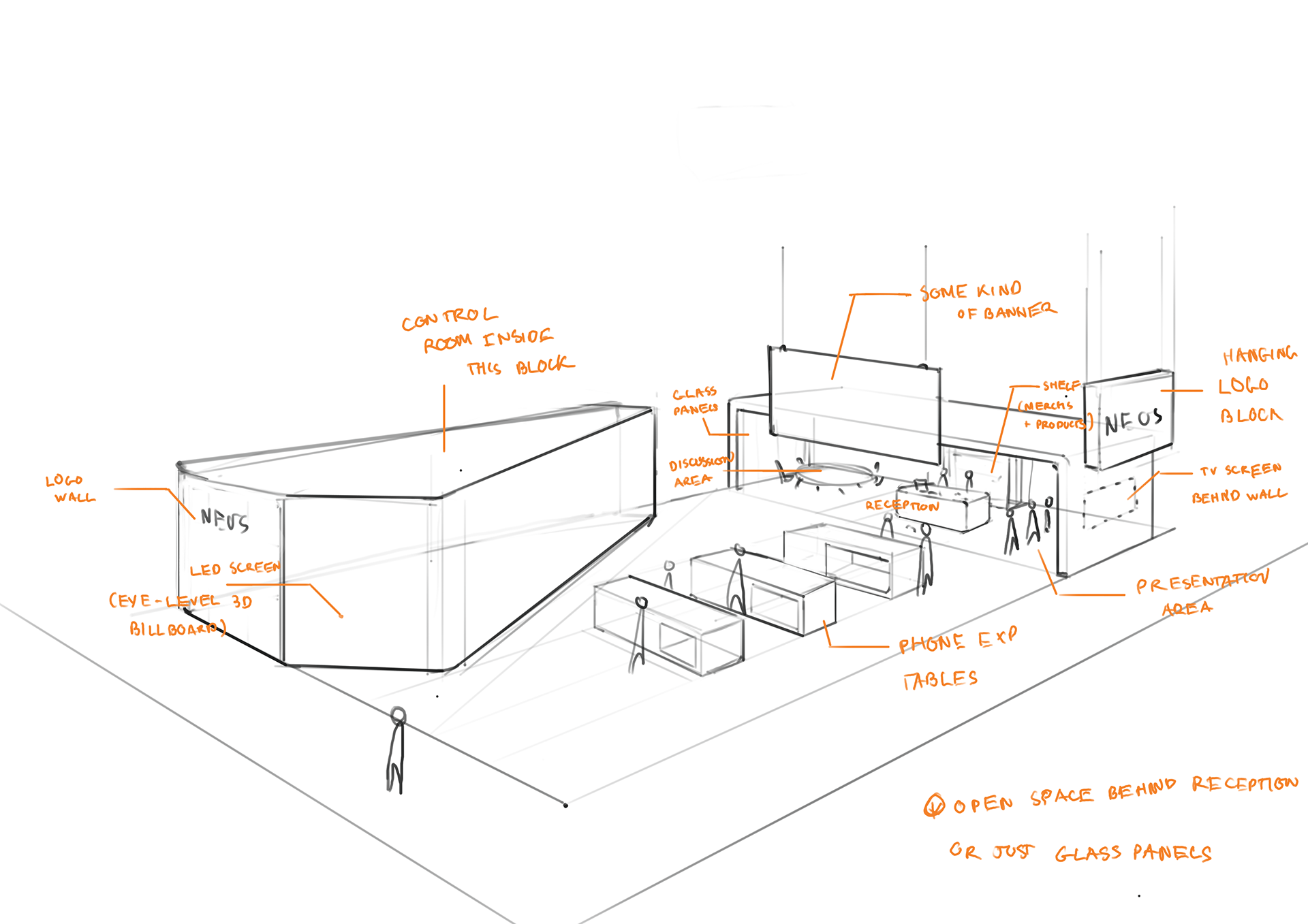
The first detailed builds
The first layout was a success, as it satisfied my sketch concepts and had the elements from the chosen aesthetics. During this stage, I also made some posters for the booth, which can be seen below.


CMF - COLOR, MATERIAL, FINISH
The material used to build this booth is MDF, painted in white, and finished with clear Class A fire retardant coatings.
MDF is affordable and durable. It also has a smooth and consistent surface that can be painted on easily. Most significantly, MDF is sustainable as it is typically made from recycled wood
Class A fire retardant coatings help prevent smoke and the spread of fire, in case accidents happen.
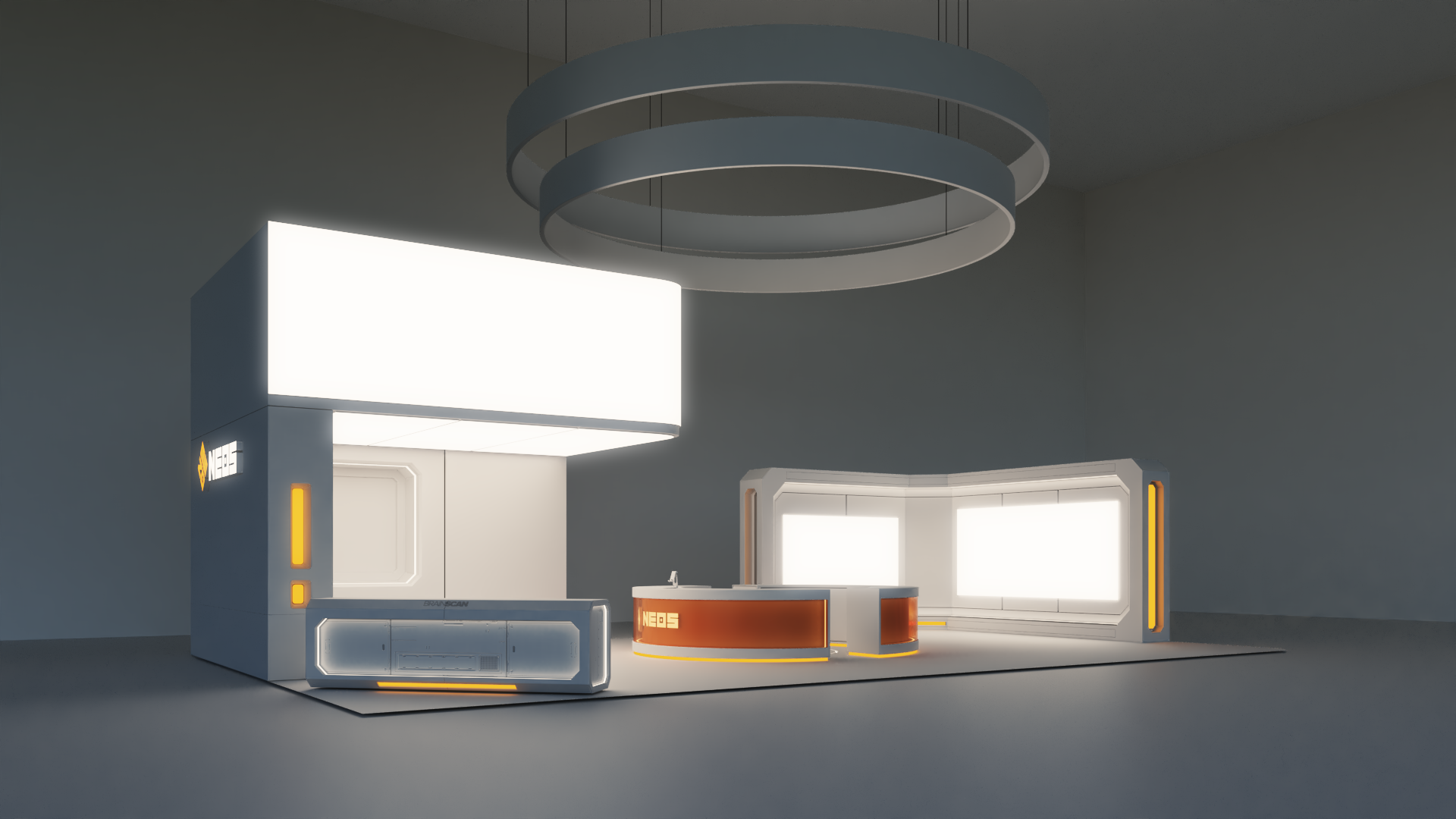
FINAL RENDERS
With the overall composition done, all that is left is texturing and lighting. For this step, I used decals to add labels, imperfections for realism, and VrayEdgeTex to create "fake" bevels since all objects are not infinitely sharp in real life. I also put in humans to develop a sense of scale.